
“NORMS IS WHERE LIFE HAPPENS” Alex Kitnick on Ed Ruscha at the Museum of Modern Art, New York
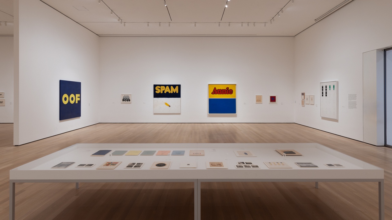
“Ed Ruscha: Now Then,” The Museum of Modern Art, New York, 2023, installation view
There only self-portrait in the Ed Ruscha retrospective at the Museum of Modern Art measures an inch and a half wide and just shy of two inches tall. It’s a passport photograph, so technically it’s a self-portrait taken by someone – or something – else, and it’s black and white, which also means it’s filled with lots of gray. Ruscha is framed just as he should be – the bottom of the photograph cutting through his dark sweater, the top cropped just above his perfect coiffure, the sides closing in on his arms and shoulders. He looks so handsome, but also slightly drunk and dissolute (not mutually exclusive traits, of course). Ruscha might be the art world’s James Dean, though he’s less of a rebel and too good with words – they’re everywhere in his art – and the artist has etched some on the photograph with a blue ballpoint pen: american on top, paris at the bottom, and in smack in the middle of his forehead like some demented proto-Manson tattoo. American in Paris. The phrase comes from a 1951 Vincente Minnelli film featuring Gene Kelly as a dancing GI, but it also aptly describes the artist at this moment in time, in 1961, at 24 years old. Here is a subject seen through the frames of authority, media, and history, which is to say as a type – and a lucky one at that. Ruscha is not an aching artist in need of expression, but rather a national entity shipped abroad, out of place but more charming because of it. God, he makes it look so easy.
Ruscha went to Paris after graduating from the Chouinard Art Institute in Los Angeles, and while there he painted Hector Guimard’s curvy art nouveau Metropolitain sign, which still crowns entrances to the city’s underground transportation. Rather than take on the whole physical thing, however, he just did the letters, which erupt like irises, and edited out the vegetal struts plunging into the cityscape. [1] Ruscha’s painting isn’t a street scene, in other words. It’s more like Jasper Johns’s Flag (1954–55) than Childe Hassam’s early 20th-century paintings of American banners hanging out wavy on Fifth Avenue. Johns meant a lot to Ruscha (he once called him “an atomic bomb”), and like the elder artist, Ruscha centered his motif, the lime green lettering, on a piece of paper and lapped around the edges with thick red paint. [2]
Ed Ruscha, “Every Building on the Sunset Strip,” 1966
Ruscha has a great feel for fonts, but he’s not a partisan of any particular style. Soon after completing his grand tour (in addition to Paris, Ruscha visited Spain, the Netherlands, and Germany) he was back in Los Angeles, working on Annie (1962), its liquid letters borrowed from the comic strip; Large Trademark with Eight Spotlights (1962), projecting “20th Century Fox” straight from the studio in single point perspective; and Actual Size (1962), with its different depictions of SPAM, the canned meat, not the email (though the latter valence seems fitting for an artist so fascinated with communication). Ruscha also worked with words that weren’t brand names and logos but still had currency. Consider BOSS (1961), in chubby black letters, and ACE (1962), with its tacky blue italics. There’s also OOF (1962, reworked 1963), its straight yellow characters centered on a deep navy field. Seen today in MoMA’s airy galleries, these paintings look like premonitions of contemporary communication housed in hashtags and bubbles, transmitted in text messages and memes.
Ruscha famously said that words have no scale. He might have also said that they have no substance. His response to the former was to expand and deflate them whereas his implicit reply to the latter was to render them material, to make them out of anything at all. If pop artists typically traded in smooth designs, Ruscha gummed up the works – BOSS, for example, is thick with scatological browns, its greasy paint running up against the edges of the painting’s design. Where Pablo Picasso and Georges Braque used sand against their “terrible canvas,” and Johns coagulated his with encaustic, Ruscha took an archer tack; impasto wasn’t enough. In 1969 he made a portfolio of Stains, with urine, cum, blood, Coca-Cola, Pepto-Bismol, Knudsen milk, and Texaco motor oil spilling specimen-like onto sheets of paper, and soon after, Ruscha built up phrases and bits of speech from similarly sundry materials, such as lettuce and gunpowder. Medium and message tease one another here, opening up philosophical puzzles about looking versus reading, a game that Johns also relished, but Ruscha brings smell and taste to the table, too. The results are multisensory and cerebral, clear as day and totally opaque. One wonders what one is looking at – and what one is reading.
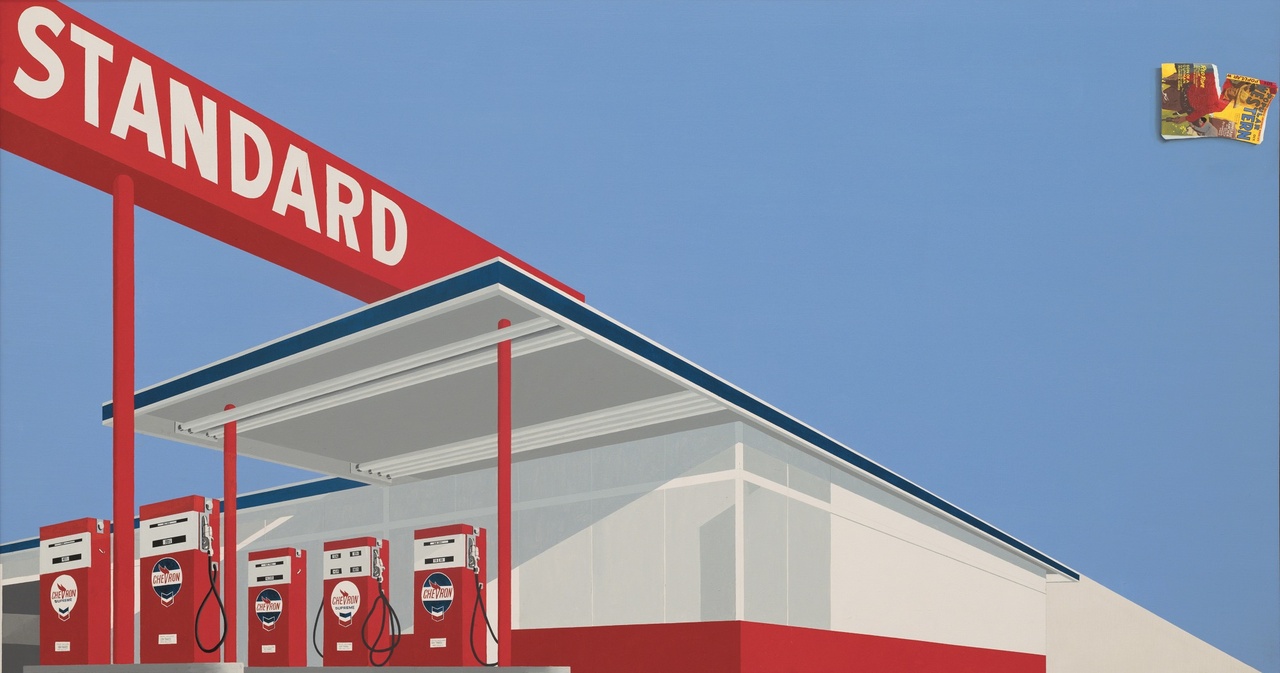
Ed Ruscha, “Standard Station, Ten-Cent Western Being Torn in Half,” 1964
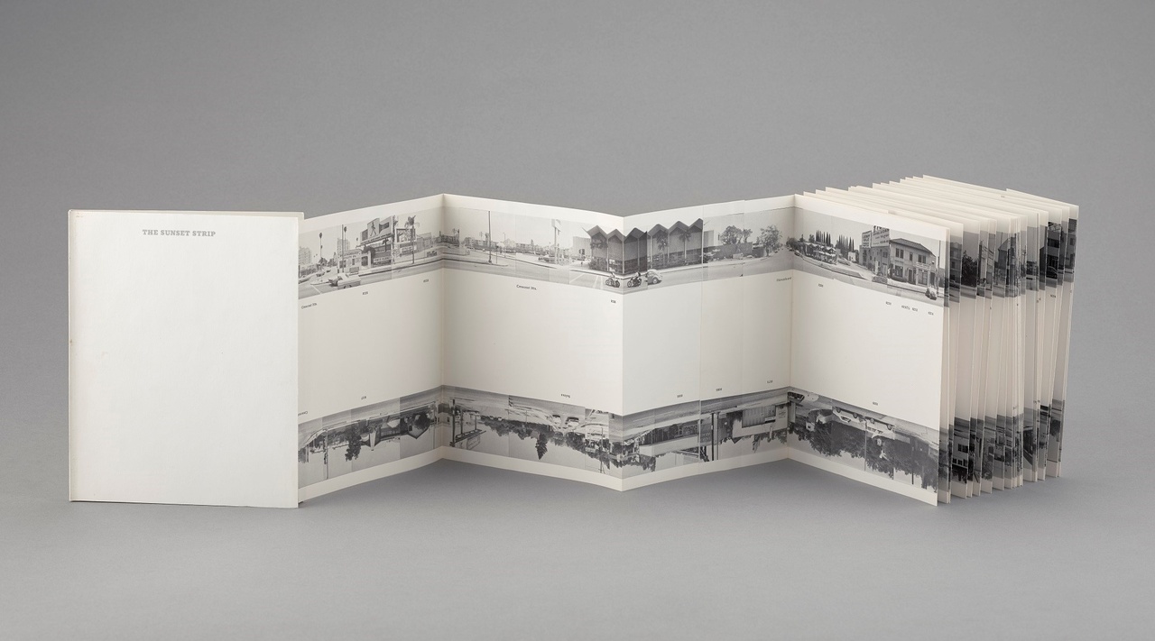
In addition to Metropolitain (1961), Ruscha made another signal work in Paris featuring a small wad of collage, the word ZONE neatly lettered above in black capitals, each component safe in its designated rectangle. Ruscha has said that he didn’t learn anything on his trip to Europe – “I just yawned a lot” – but it’s hard not to see this work as a small homage to Guillaume Apollinaire, the great partisan of the Cubists, who wrote excitedly of printed matter in his poem “Zone,” included in his 1913 book Alcools. [3] “Flyers catalogs hoardings sing aloud,” he wrote. “Here’s poetry this morning and for prose you’re reading the tabloids.” [4] Apollinaire saw new media usurping ancient epics just as Victor Hugo claimed that “this will kill that,” [5] the book replacing architecture, and Ruscha concurs. Soon after his European vacation he started producing a litany of quizzical little books – Twentysix Gasoline Stations (1963), Various Small Fires (1964), Some Los Angeles Apartments (1965) – that are somehow simultaneously straightforward and unclassifiable. They don’t look like livres d’artistes of times past, but they also don’t “sing aloud” about the modern world. On the other hand, they’re not quite as humdrum as they first appear. While bearing a family resemblance to instruction manuals and sample books, their emphasis on the various raises questions about reliability. Douglas Crimp once described them as outliers to the “present system of classification.” [6] Neither this nor that, Ruscha’s tomes rather served as the first volumes in what is now an overwhelming cornucopia of artist books. (Call it pop paperwork.) But perhaps most importantly, these titles doubled as business cards, passports, and secret handshakes for a burgeoning network of like-minded wry guys in the LA art world of the 1960s.
Ruscha’s books are often discussed at arm’s length from his paintings. There is Ruscha the conceptual artist and Ruscha the painter, and never the two shall meet. The books are for bookish people, the thinking goes, and the paintings for people who buy – or contemplate – paintings. Never mind that Ruscha is also an inveterate draftsman and printmaker – two activities that occupy a space between these poles. But the books need to be read in relation to the paintings, and vice versa, and not simply because they hold subject matter in common. Helpfully, Christophe Cherix, the Robert Lehman Foundation Curator of Drawings and Prints at MoMA, has placed the artist’s publications and leporellos in prominently placed vitrines – a copy of Gasoline Stations even hangs from the ceiling for visitors to flip through – but it’s somewhat inevitable that the size and pow of Ruscha’s paintings overwhelm his rather modest books, though similarities in subject matter and style stand out all the same. Perhaps more important is that the books and paintings both possess standards and set formats – and that Ruscha has decided to stick closely to them, if only to tinker with their conventions. It can’t be an accident that Ruscha depicted a Standard gas station when Esso and Texaco were also available, or that he set a Norms diner on fire when IHOP and Langer’s also dotted the landscape. [7] While they each have their own patterns of circulation, books and paintings both belong to clear-cut networks and systems. They have typical dimensions, too. If a paperback book is some inches wide and a few inches taller, Ruscha’s first paintings are all about five by five feet, give or take. Picture size. The typical nature of Ruscha’s early work is brought into relief when surveying the rest of his career. Every once in a while, he stretches out, goes wonky, but for the most part his paintings are just as they should be – and Ruscha is good with should. Ed Ruscha is no radical. He appears most content when toying with the nuts and bolts of convention.
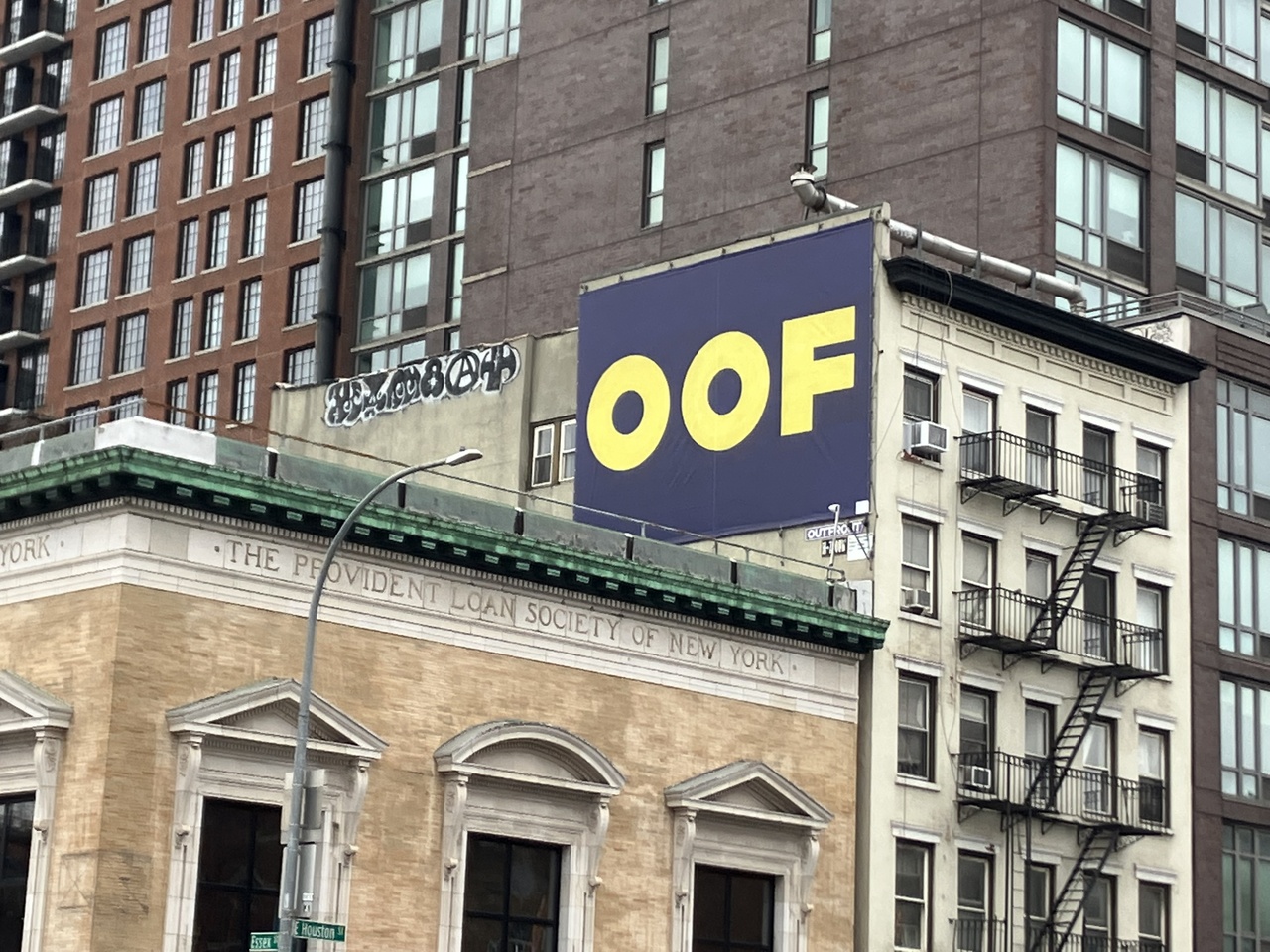
Advertisement for “Ed Ruscha: Now Then” on the corner of Essex and E Houston (The adjacent former building of Provident Loan Society was once used by Jasper Johns as his studio), 2023
It’s hard to march forward in time. It’s difficult, too, to walk through a career spanning over 65 years and keep everything straight with history, to square canvas with chronology. With these big career surveys, the further they stretch the less you learn. (While the current exhibition has its fair share of archival finds in the early stretches, one should look at 1982’s “The Works of Edward Ruscha” for a more in-depth look at the artist’s production up to that point.) Ruscha himself has played with periodization over the years; in 1980 he made an enormous horizontal painting called The 1950s, which scatters the decade’s years (1951, 1952, etc.) across a sublime sunrise; he also made a pendant painting called The 1990s, which stares at the sunset. Always historicize, Fredric Jameson said, and Ruscha agrees. The artist situates his work in the topoi of time and in the conventions of place. Clement Greenberg once called Abstract Expressionism “American-type painting,” arguing that it purged “expendable conventions” in order to get at something absolute. [8] He saw in Clyfford Still’s canvases a remnant of what he called “’buckeye,’” a kitsch mode of painting, full of “dark heat and dry skin,” but he claimed that Still transcended its origins to create a “serious and sophisticated art.” [9] Ruscha, by contrast, offers a kind of “American-type painting” in reverse, filling his canvases with clichés and conventionality, challenging notions of serious and sophisticated. The snow-covered peaks in the artist’s late paintings are worthy of a Coors commercial. But Ruscha paints Americana in a twilight mood. He knows, working over a century after Thomas Cole, that the course of empire is decline or at least that it is transforming into something else.
Is “oof” an American word? Or is it a white male American word? Is it what Boss says when he bumps his head? Or is it what Ace exclaims when someone cuts him off on the Pacific Coast Highway? Ruscha’s painting has been all over New York lately as part of MoMA’s marketing campaign – you can buy a hoodie, too – and it’s a strange thought bubble for a diverse city. How many people still say this word? Who said it ever? The artist Deborah Kass made a big yellow sculpture in 2016 that riffs on Ruscha. (A version stands currently in front of the Brooklyn Museum.) Seen from one vantage point it reads OY, a Jewish expression of bemused grief; the other way around it spells YO, a Black salutation or the first-person singular in Spanish. The work’s sculptural dimension brings the viewer’s body into play, and as one circles the work an experiment with identity takes place. Maybe it becomes less fixed – or else you pick a side. For all his cleverness, Ruscha is less playful than Kass. Low-key and overheard, the voice captured in his work is still the voice of authority, or at least how authority once articulated itself. But his work doesn’t relish this power. It’s self-conscious and self-questioning and, especially in the later canvasses, maybe even self-loathing. Oof, indeed.
“Ed Ruscha: Now Then,” the Museum of Modern Art, New York, September 10, 2023–January 13, 2024.
Alex Kitnick teaches art history at Bard College in Annandale-on-Hudson, New York.
Image credit: 1. Photo Jonathan Dorado; 2. © 2023 Ed Ruscha. The Museum of Modern Art, New York, Department of Imaging Services, photo Jonathan Muzikar; 3. © 2023 Edward Ruscha. Photo Evie Marie Bishop, courtesy of the Modern Art Museum of Fort Worth; 4. Photo Alex Kitnick
Notes
| [1] | Guimard’s sign can be seen outside in MoMA’s Sculpture Garden. |
| [2] | Ed Ruscha, “Statement in Henry Hopkins, 50 West Coast Artists,” in Leave Any Information at the Signal: Writings, Interviews, Bits, Pages, ed. Alexandra Schwartz (Cambridge, MA: MIT Press, 2002), 11. |
| [3] | Howardena Pindell, “Words with Ruscha,” in Ruscha, Leave Any Information, 58. |
| [4] | Guillaume Apollinaire, Alcools, trans. Donald Revell (Hanover, NH: Wesleyan University Press, 1995), 3. |
| [5] | See the chapter of the same name in Hugo’s The Hunchback of Notre-Dame (1831). |
| [6] | Douglas Crimp, On the Museum’s Ruins (Cambridge, MA: MIT Press, 1993), 78. |
| [7] | In Ruscha’s typically oblique fashion, the latter scene is cropped so that the “N” and a bit of the “O” in the sign’s name go missing; one has to resort to the work’s title, or prior knowledge, for things to fall into place. |
| [8] | Clement Greenberg, “'‘American-Type’ Painting,” Art and Culture: Critical Essays (Boston: Beacon Press, 1961), 208. |
| [9] | Ibid., 224. |