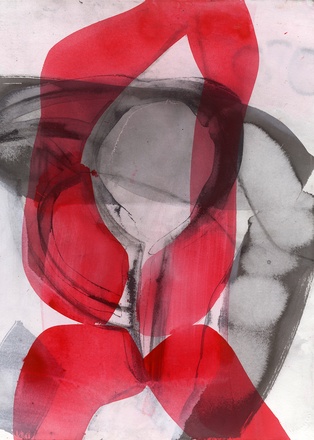
Amy Sillman
pink pink pink black 2 (2016)
“What makes Ad Reinhardt great,” wrote Amy Sillman in an essay for her 2009 zine “Das Diagram,” “is the split that makes up his greater whole […]: not just his solemn geometric abstractions, nor his uproarious collages […] but the circulation between them, a circulating economy in which solemnity is equivalent in value to satire.” Such an understanding of the plasticity of a work’s limits is evident in Sillman’s “pink pink pink black 1 & 2,” for which the New York-based artist has selected not one but two works on paper: “Pink Drawing #4” (2016; at left) and “Pink Drawing #19” (2015; at right) – two nodes within a larger network of drawing-based procedures between which the collector is invited to choose one. These pieces (exhibited this past year at New York’s Sikkema Jenkins gallery and Kunsthaus Bregenz [KUB], respectively) are here put into new circulation as archival pigment prints. Their genesis, meanwhile, comes from her intense interest in a fifteenth-century Roman Catholic Bregenz chapel, which, contra the more austere mood of the surrounding architecture (for example, Zumthor’s Kunsthaus), offsets its sober stucco walls with stripes and odd shapes rendered in shocking pink. Metabolizing the peculiar corporeal details of this space over the course of her site visits to Bregenz, Sillman limited her palette for her KUB project as a response to the chapel’s dominant tones – “pink pink pink and black.” Just as Sillman’s painting often bleeds into drawing, diagramming, digital animation, and other forms, her painted gesture, therein, is itself never restrained to the realm of either figuration or abstraction. Taken together with the notion of responsive “relational” color, these elements form a circulating economy of language – here, pools of gradient reds and tectonic greys that waver in form between calligraphic line, bodily gesture, and poetic mark.
Ditone print, 70 × 50 cm, edition: 100 + 20 A.P. + 2 P.P., numbered and signed on the back, each motif € 350.– plus shipping.We offer the choice of selecting one of the two motifs.


